Case studyInformation design
parenting piecedocumentation
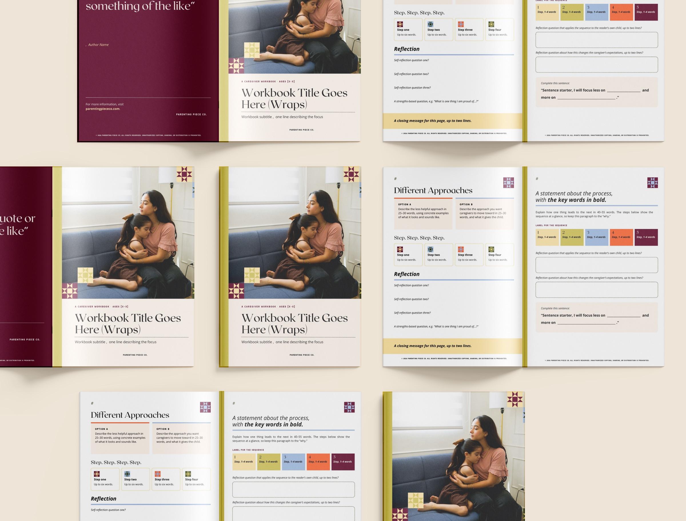
A plug-and-play template system for Parenting Piece Co.'s presentations and workbooks.
- Role
- Designer
- Client
- Parenting Piece Co.
- Timeline
- 3 weeks
- Team
- Co-designer Brynn Lacey
- Deliverables
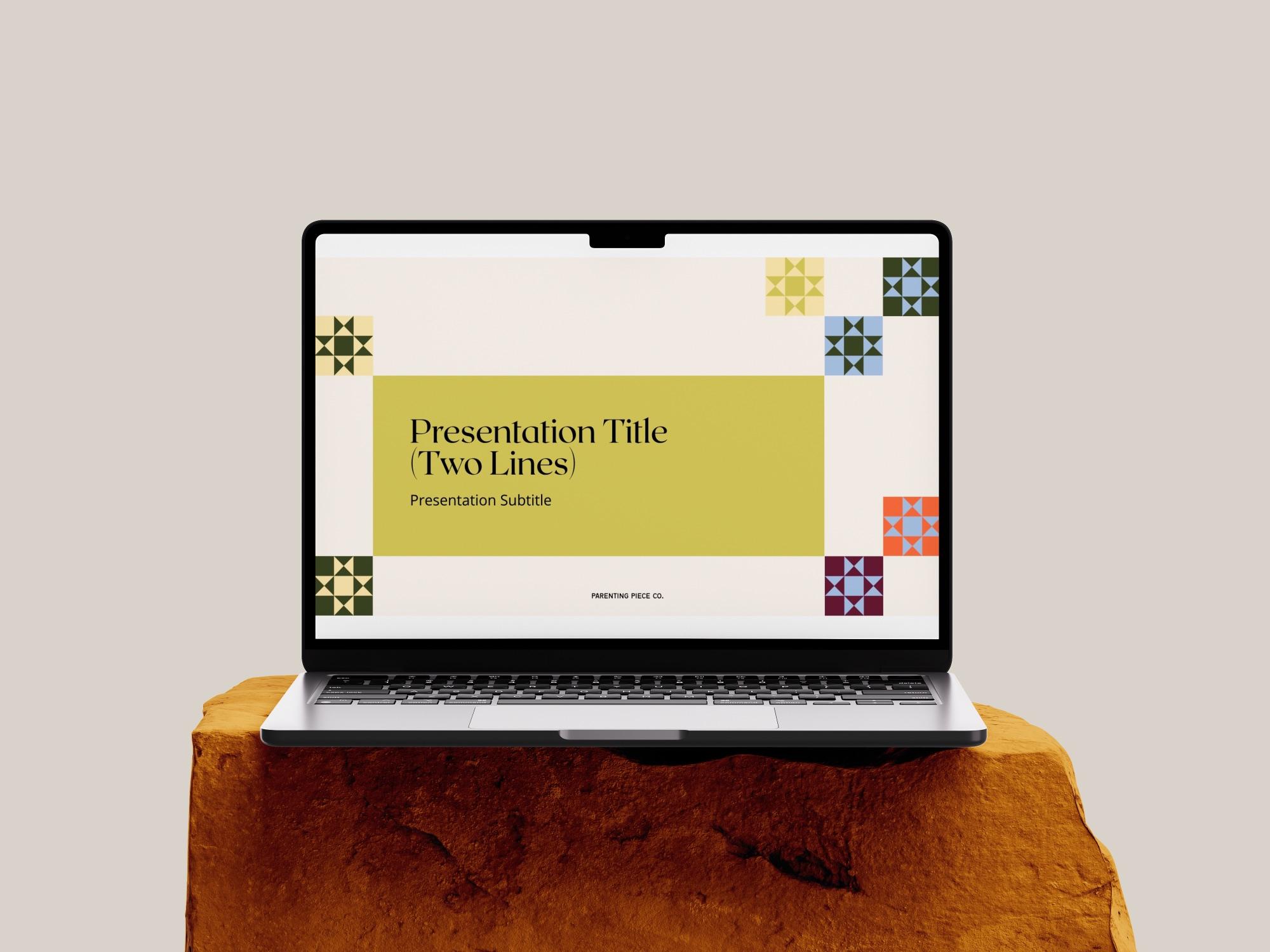
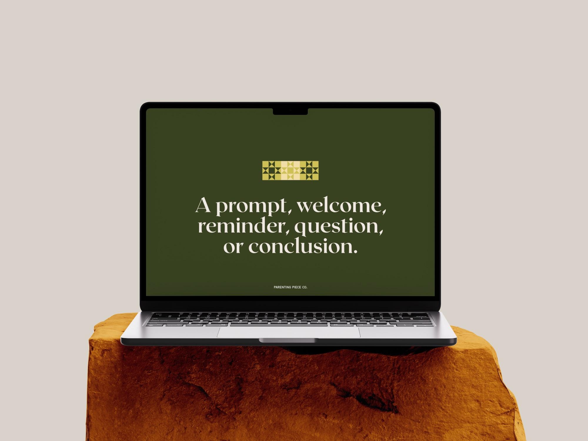
- Presentation template
- Client workbook template
02
The challenge
Parenting Piece Co. needed a plug-and-play template system built on their updated brand, which I helped develop with co-designer Brynn Lacey. We were working on a budget.
Their clients are people taking parenting and social work classes, often while dealing with something difficult, like supporting a troubled child. Some of them may be feeling distressed or overwhelmed. The existing workbooks held a lot of valuable content, packed closely onto each page.
My job was to give that content a structure that is easy to read, easy to process and visually soothing, with plenty of room for reflection.
Goals
- Design a workbook that applies best practices like clear information architecture and hierarchy, for a sensitive client base.
- Build plug-and-play templates so the team has everything they need to set up new materials quickly.
- Stay within the client's budget.
03
Research
I read through Parenting Piece's existing workbooks and presentations to understand what they are really trying to convey. I wasn't designing finished workbooks. I was designing templates they would fill in themselves, so I needed to know what kind of content every workbook holds.
I also consulted with Parenting Piece and their team to find out what they needed from the templates.
Alongside this, we developed the key brand imagery. Parenting Piece is about community and bringing people together. Through ideation, concept work and looking at other brands, I asked questions that brought out what the brand really means. We landed on stitches and threads, and then the quilt: your life is interconnected, like a quilt you are building and trying to make beautiful. A quilt of care.
What I learned
- The content was strong, but it needed more space and clearer hierarchy to be easy to work through.
- Clients may be distressed or overwhelmed, so the design needs to feel safe and calm.
- The templates have to work for every workbook the company makes, not just one.
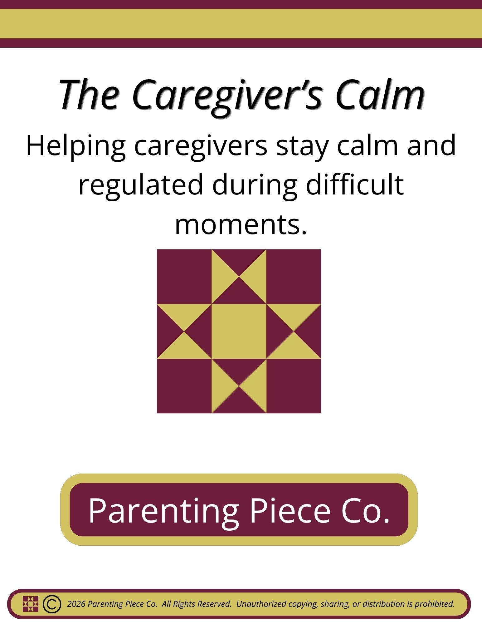
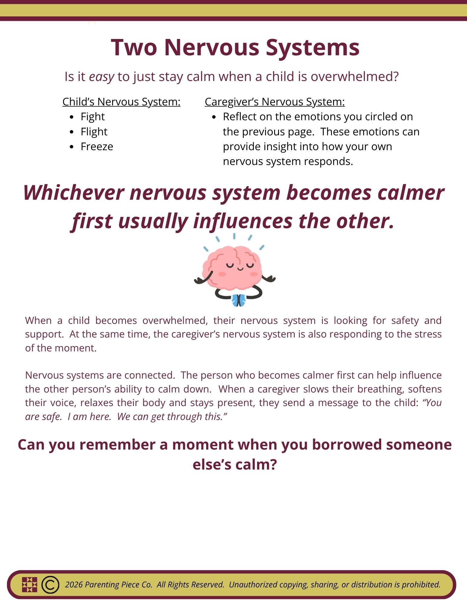
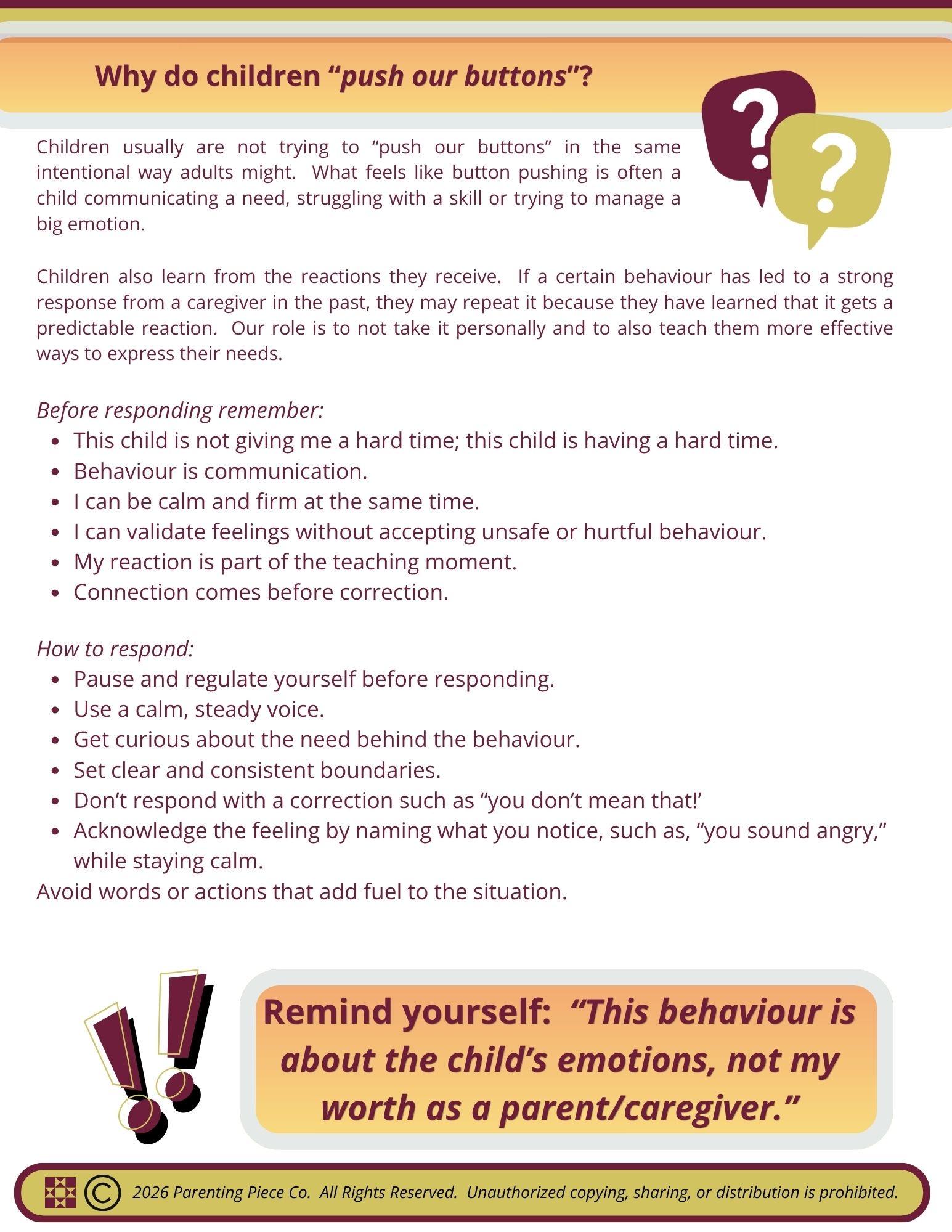
04
Process
4 stages, from first question to final design.
Define
I started by reading the contents of their workbooks to define the scope. I listed the categories of pages they already had across their presentations and workbooks, like intro, definitions and reflection pages.
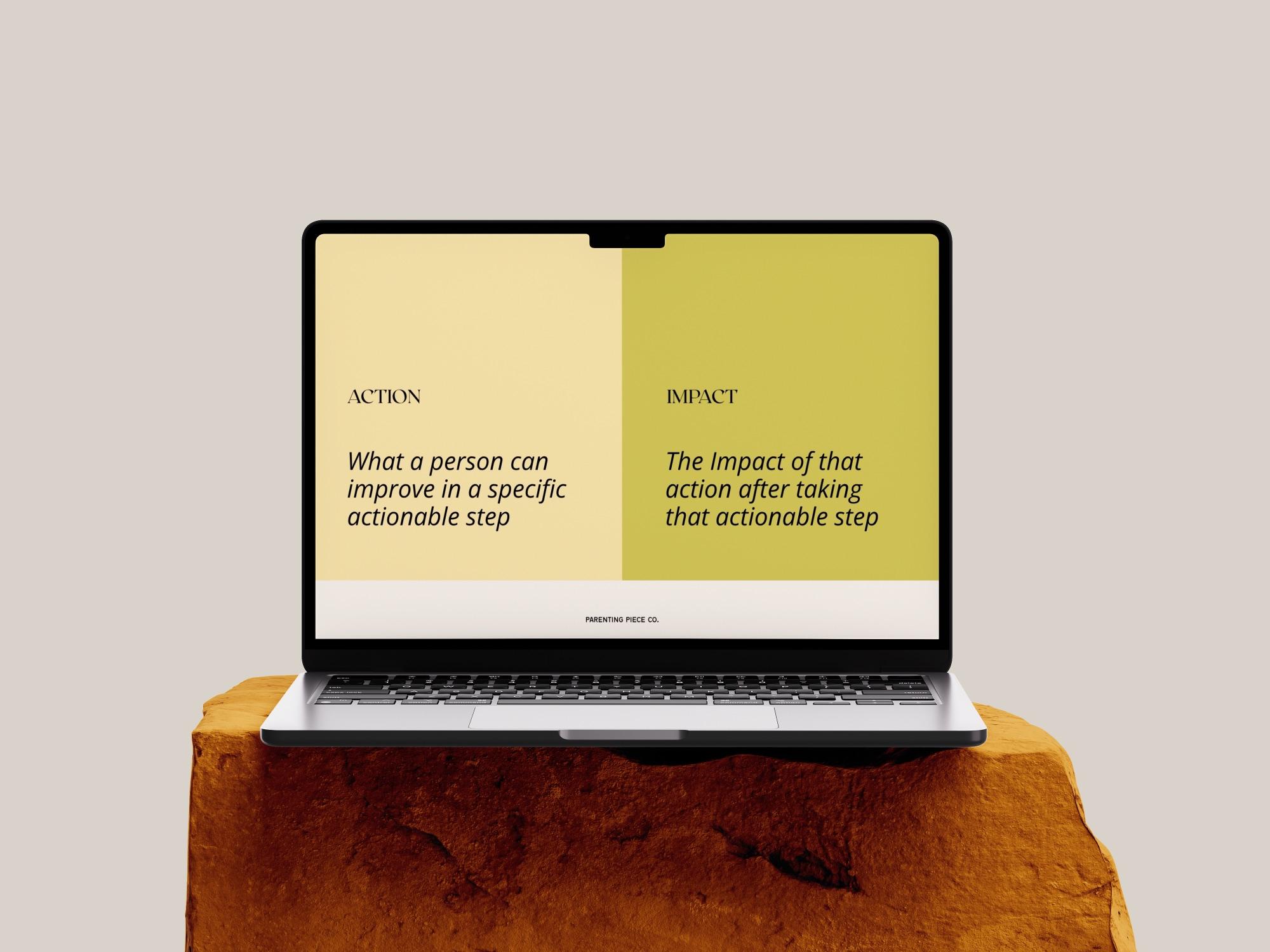
Then I looked for gaps. For example, they had no comparison page. I added ideas to fill those gaps into a master list, and ranked it by priority because we were working on a budget.
Explore
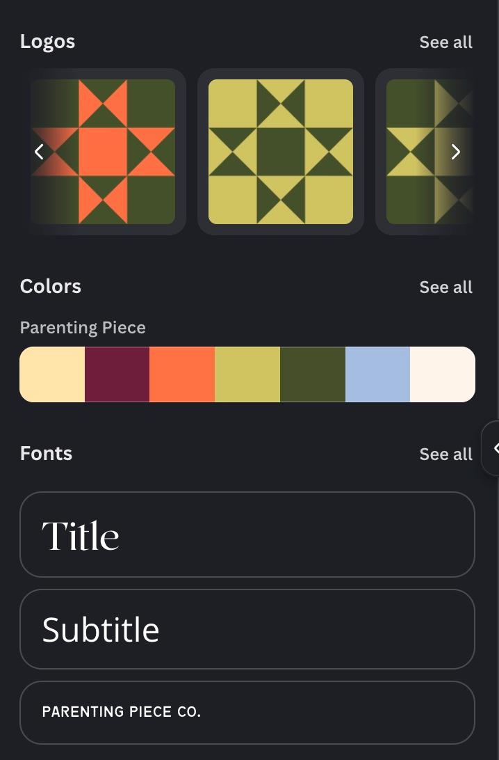
Brynn laid the foundation of the brand: the colours, the fonts and a set of icons. She also designed their website. When she got too busy, the work was passed to me.
The client's feedback was that they loved the colours but wanted a more minimal feel. There were no brand guidelines yet, so I explored how to balance the colours, set up primary and secondary colours, and decided on colour ratios.
Refine
We were working on a budget, and I didn't want to spend it on open-ended exploration. So I built the exploring into the work itself by starting with the presentation template. It was a quicker win, which gave me room to play, figure out what I wanted, and set the baseline look and design system. If I didn't like the result, I could start over without losing much time. Once it felt right, it became my guide for the workbook.
Most of the refining happened in the workbook. The presentation needed to be short, skimmable and visual. The workbook is the heart of the project, and it took more than twice as long.
Clients use the workbook to reflect on hard things about their lives, choices and behaviours. I kept asking how I was using colour, space and hierarchy, so the design would feel safe as well as look good. Instead of turning a 30-page workbook into a new 30-page workbook, I spread the content out and let it breathe.
Hand off
I finished with a consultation and training session with the Parenting Piece team. I showed them how to use the workbooks, how to maintain them as templates, and how to bring in their own content in a way that keeps the design intact.
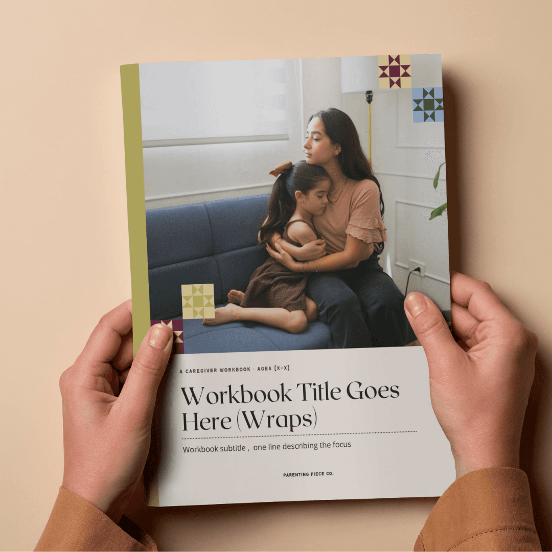
We also talked about imagery. I guided them toward quality photography over graphic clip art, and how to choose stock photos that suit the workbook.
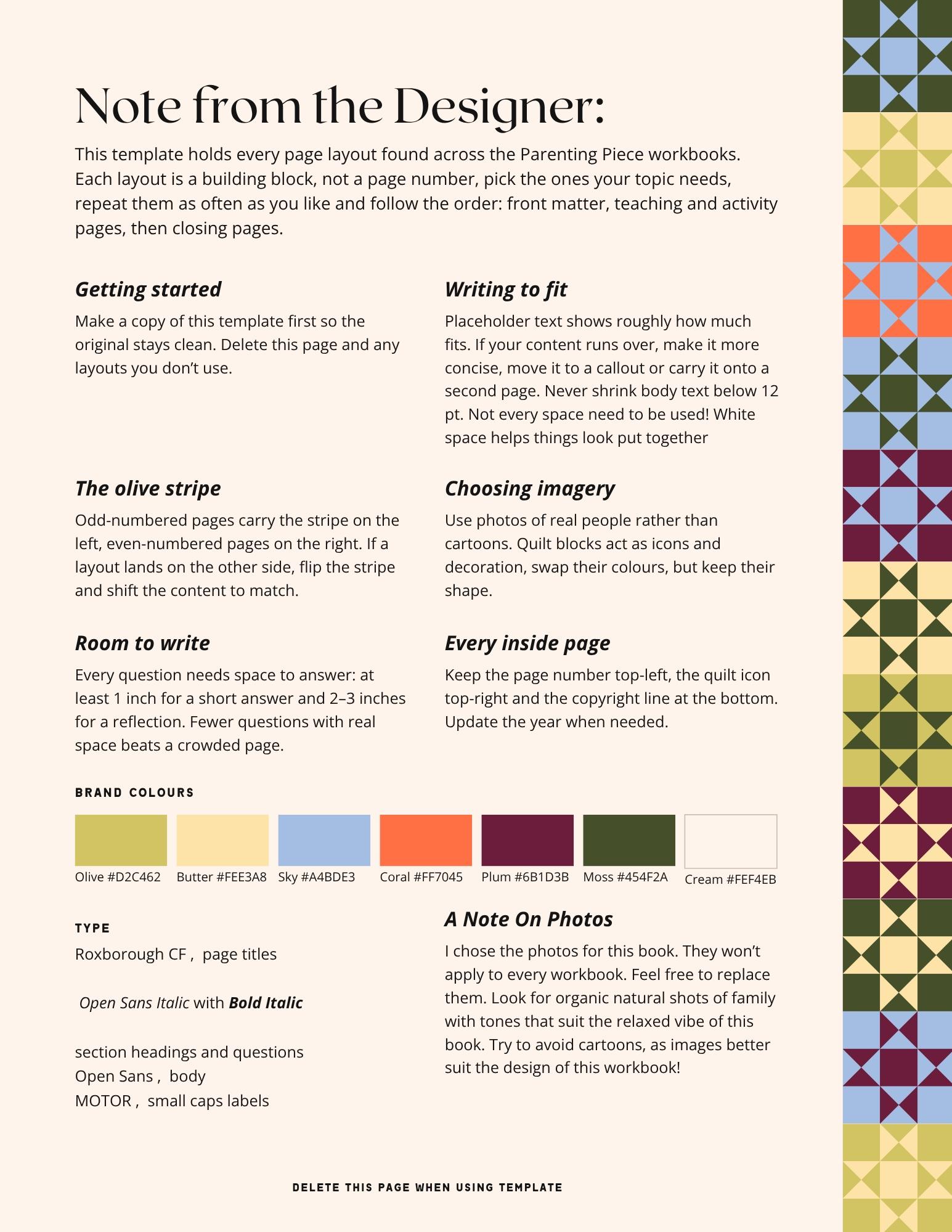
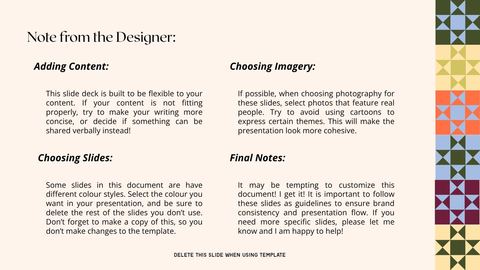
Both templates also include quick-reference pages I called "a note from the designer". They sit right inside the files and explain how to keep the brand consistent: use photos rather than cartoon graphics, and leave white space alone, because it doesn't need to be filled.
05
Key decisions
Design the presentation first
The presentation was smaller and faster to get right, so I used it to set the tone and design system. The workbook, which took much longer, then had a tested direction to follow.
Add more pages and give the content room to breathe
When you are already overwhelmed, dense pages are harder to work through. More space makes each page easier to read and leaves room for reflection.
Set the brand rules myself
There were no brand guidelines. Using the client's feedback (more white space, a cleaner look), I decided how typography, hierarchy, icons and fonts are used. Parenting Piece will keep using these rules going forward.
Build the brand rules into the templates
I've handed off projects before where the rules got lost after launch and the brand slowly drifted. Putting the guidelines inside the templates, as notes from the designer, keeps them in front of the team every time they make something new.
Set it up for print as well as screen
Classes usually run online, so the workbook will mostly be used digitally. Printed copies are also available to buy, so I set the file up properly for print too.
06
The solution
I delivered an easy-to-use client workbook and a presentation template, built with strong hierarchy and clear information architecture. They bring together the brand rules I set and Brynn's foundation of colours, fonts and icons.
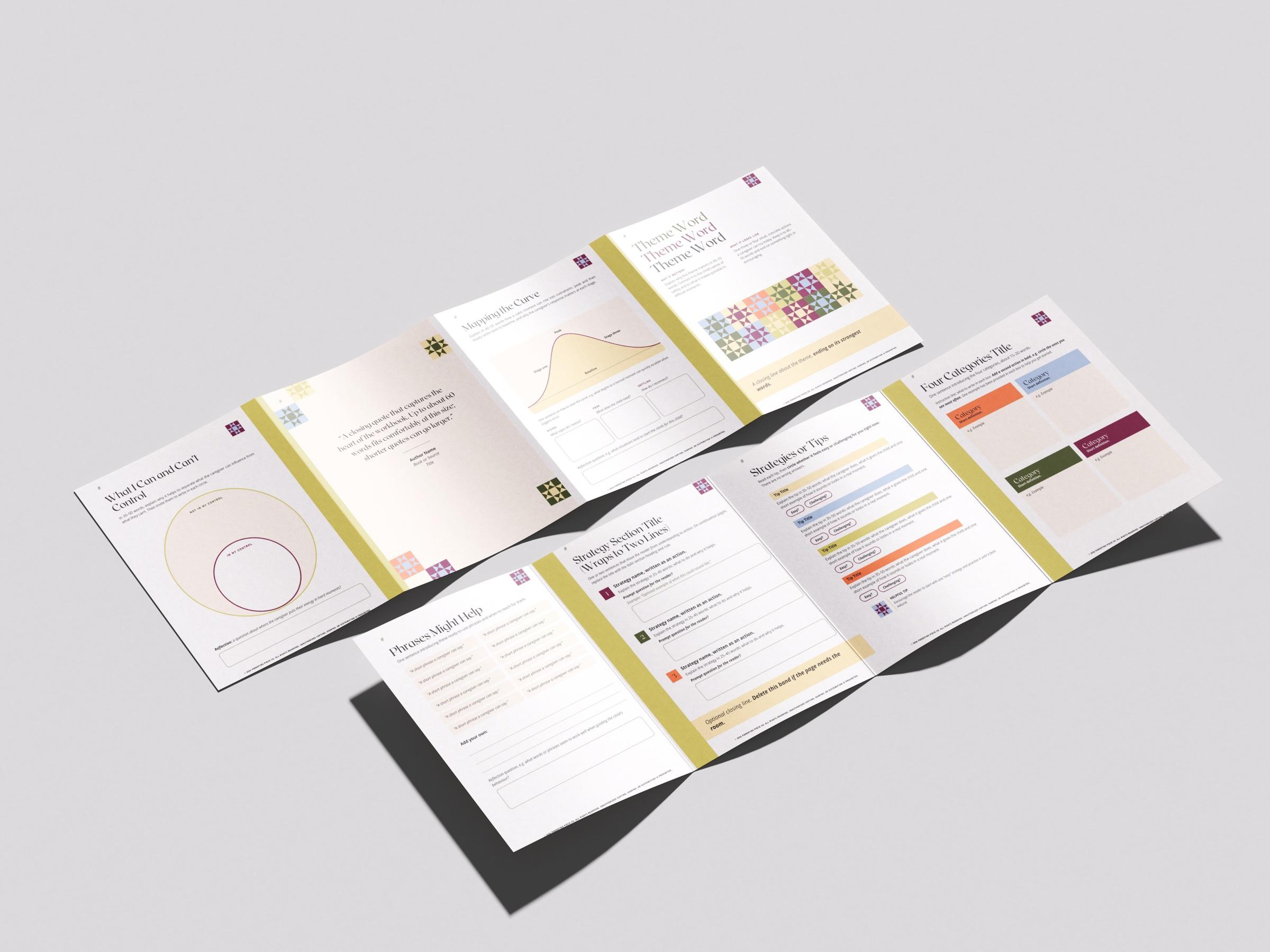
The workbook template is 34 pages, ready for both screen and print. It covers every kind of page their content needs: an intro, a table of contents, and section pages that make the existing sections visible for the first time. There are concept pages that explain an idea and help the reader reflect on it in their own life, and pages for frameworks, steps, processes and theories. It also includes definitions, writing exercises, checklists and activities like circles of control, side-by-side comparisons, strategies and tips, scenario practice, making a plan, quotations and key takeaways.
Each page type comes in a few variations, so the team can show different kinds of content. Some build on pages they already had, and some are brand new, designed from my understanding of what they needed.
The templates are plug and play, so Parenting Piece staff save time and energy when designing their classes. The workbook also works as a facilitation guide: facilitators use it in class to walk clients through each exercise.
The project came in on budget.
07
Results
The feedback from Parenting Piece was very positive. They are just getting started with the rebrand, so the workbooks are only beginning to be used.
The project gave the company a foundation of brand rules and a set of clear, readable assets, which brings more structure to how they create materials. The aim is for clients to find the new workbooks more welcoming and easier to understand.
08
Reflection
Working within someone else's rules and constraints can be challenging, but this project felt like a natural fit. I felt a strong connection to the brand, its purpose and the design direction, and I'm grateful to Brynn for setting up such a fun brand kit of colours, fonts and icons to build on.
The team was excited to receive the templates, and the project seemed to spark new energy around their business and mission. That was great to see. I wish every project let me use my whole skill set and feel this connected to the work.
09
Tools used
- CanvaThe team already works in Canva for their business, so I built everything there, set up as formal templates within their brand kit.
Freelance studio
Have a projectin mind?
Book through my studio. The short intake form asks about your project, timeline and budget, and I will get back to you about fit and next steps.