Case studyBrand identity
megabytebrand kit
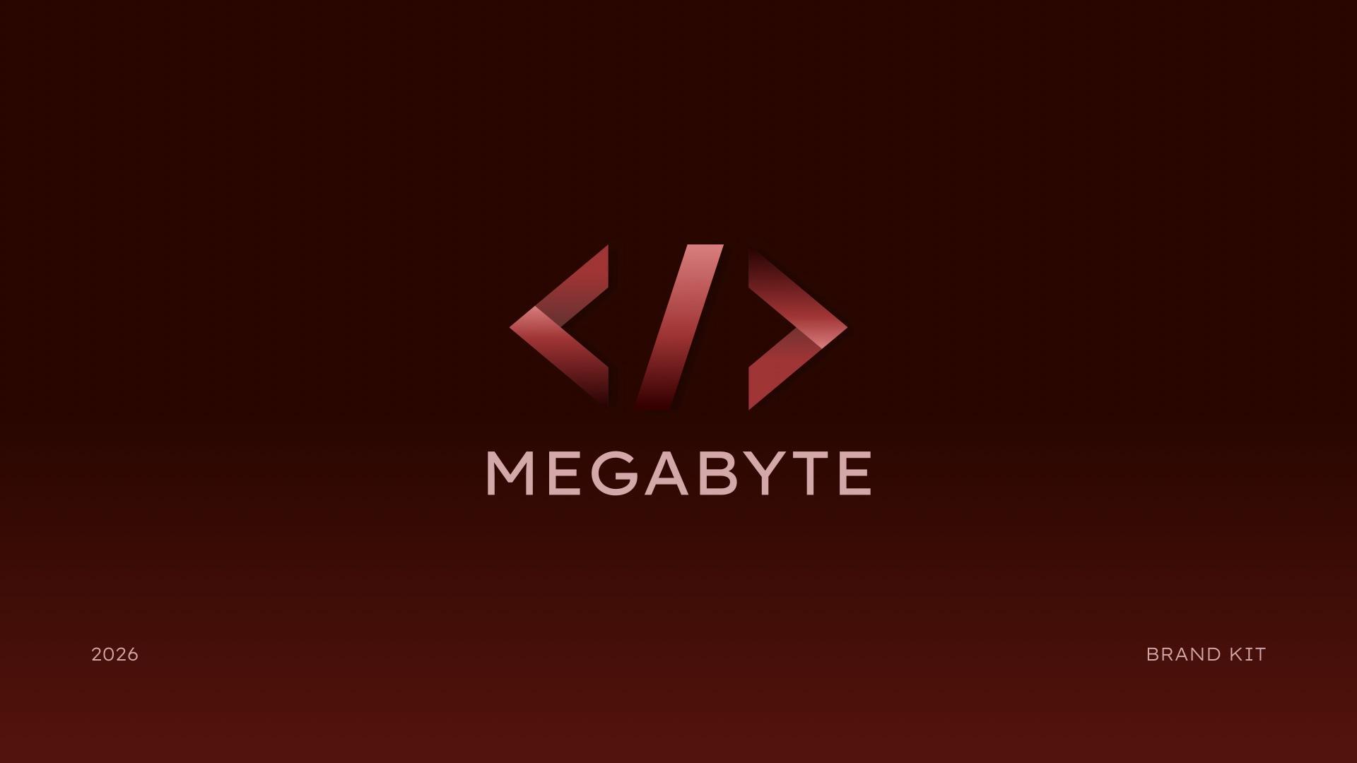
A logo suite and brand guidelines for Megabyte, a software development club at SAIT, so every platform shares one consistent look.
- Role
- Graphic designer
- Client
- Megabyte
- Timeline
- 1 month
- Deliverables
- Logo suite
- Brand guideline kit
02
The challenge
Megabyte is an academic club at SAIT in Calgary, focused on software development. They needed a quick rebrand over the summer, on a tight budget.
They had no consistent logo files and no rules for how the logo should be used. There were several slightly different versions of the logo, and every platform looked a little different.
My job was to give them one well-made logo and a set of guidelines and files they could use across all of their social media. I didn't implement the brand myself. I set up the rules and held a consultation with club members on how to use it.
Goals
- Work with the club's existing expectations of what the brand should look like.
- Bring new life into that existing brand.
- Finish within the timeline and follow the schedule I set.
03
Research
Research was fairly brief. I got on a few calls with the club to understand their needs and to set expectations for the timeline and for my own capacity.
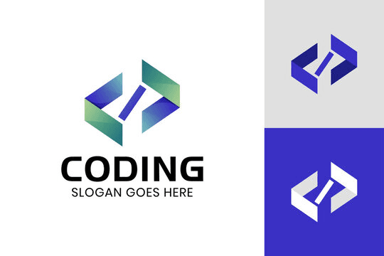
We looked through Pinterest and other platforms together to understand the general feel they wanted, which stylistic choices they preferred, and what their existing brand looked like.
What I learned
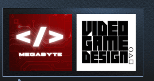
- They didn't want to move too far from their previous brand. They were attached to the colours and even the logo.
- The existing logo had been put together quickly and had grown into several different versions, so the club needed one logo that was properly made.
- They were drawn to transparency, gradients and colour.

04
Process
4 stages, from first question to final design.
Consult
I started with a consultation to understand the club's requirements, then set the scope, timeline and schedule for the project. We gathered inspiration together to pin down the feel they wanted.
Explore
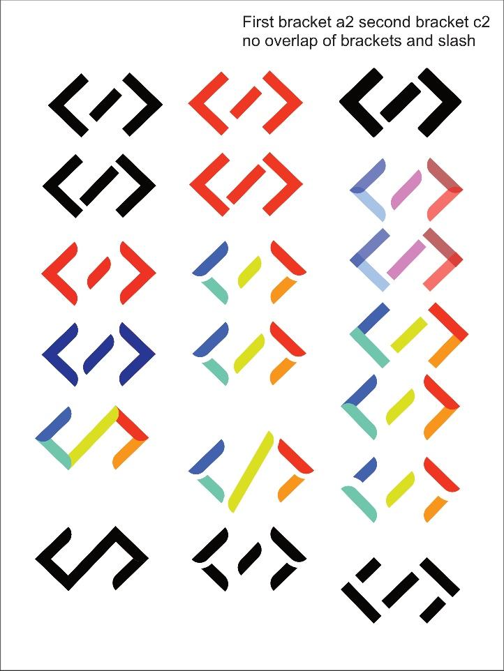
I started the iterations in Affinity and came up with a lot of variants. Some went past what the club had asked for, including a rainbow logo with curved, organic shapes that played with transparency, gradient and colour. The club really liked it.
But the club works as a whole team and needed to keep some of its previous styling, so a full revamp wasn't realistic. We stepped back and re-centred on the existing brand, moving from a rainbow palette to red and a darker colour.
I sent the iterations over, and the club picked a handful they liked.
Refine
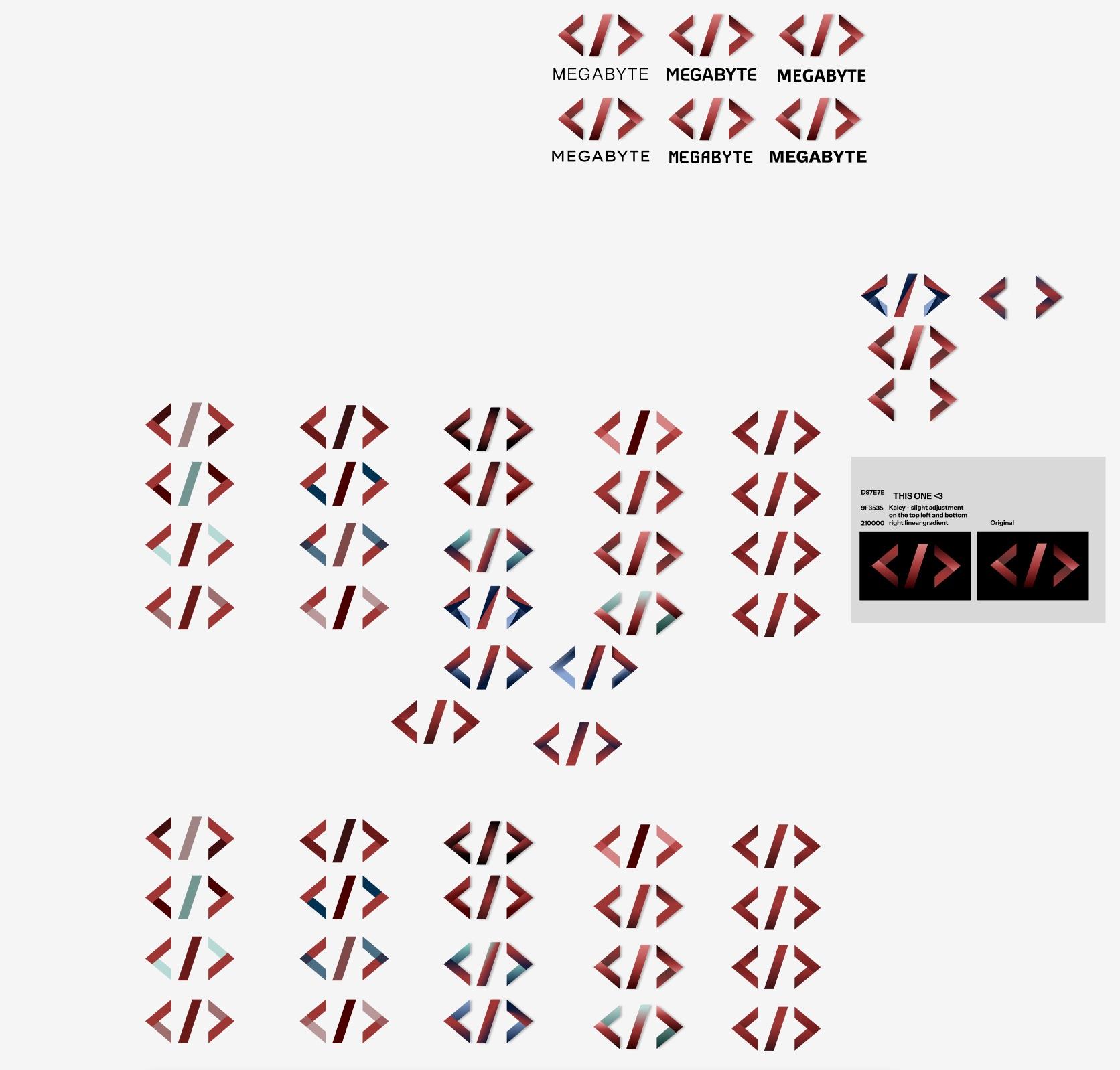
I moved their picks into Figma so I could share a link, and we worked through a second round of feedback to get a more precise result.
From there I honed the logo and worked through its variants and use cases: a light mode and a dark mode, and how the red baseline looks on different backgrounds.
The full logo is much wider than it is tall. Next to the SAIT logo, which is closer to a square, it looked awkward, so the club also needed a version that sits comfortably beside it on flyers.
Hand off
I passed the brand kit and logo suite to the club's designer, and held a consultation with club members on how to use the brand.
05
Key decisions
Rebalance the brackets and the slash
In the previous logos the slash was less steep and the brackets were smaller. The club was attached to those proportions, but I reshaped both so the mark looks cohesive and balanced. It may read as less literal, but a logo isn't meant to be literal. It's meant to leave an impression. After some back and forth, this is the version we kept.
Move from Affinity to Figma for feedback
Affinity was quick for early exploration, but the club needed to see and comment on the work easily. Figma gave us a shareable link for the second round of feedback.
06
The solution
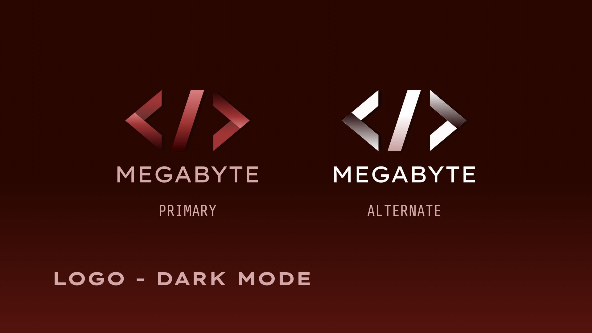
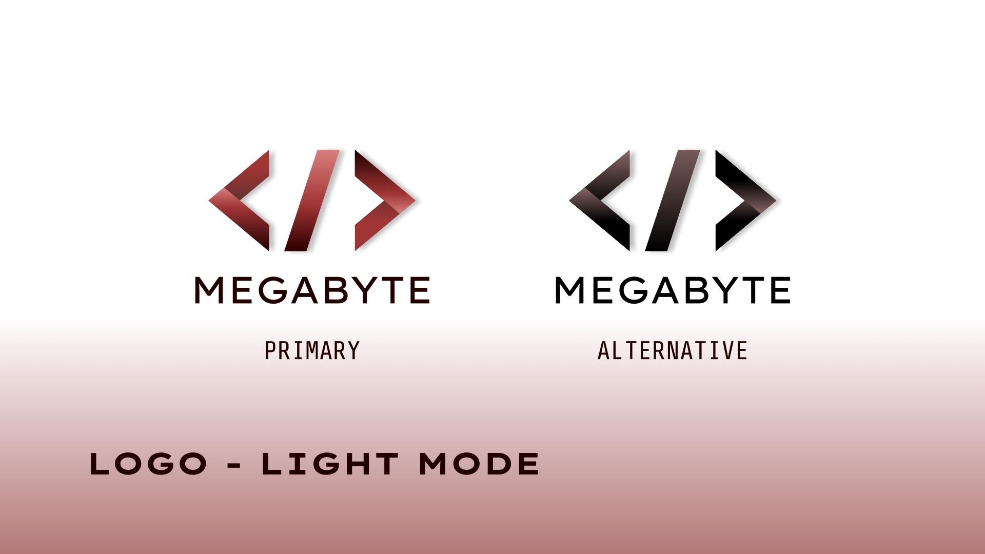
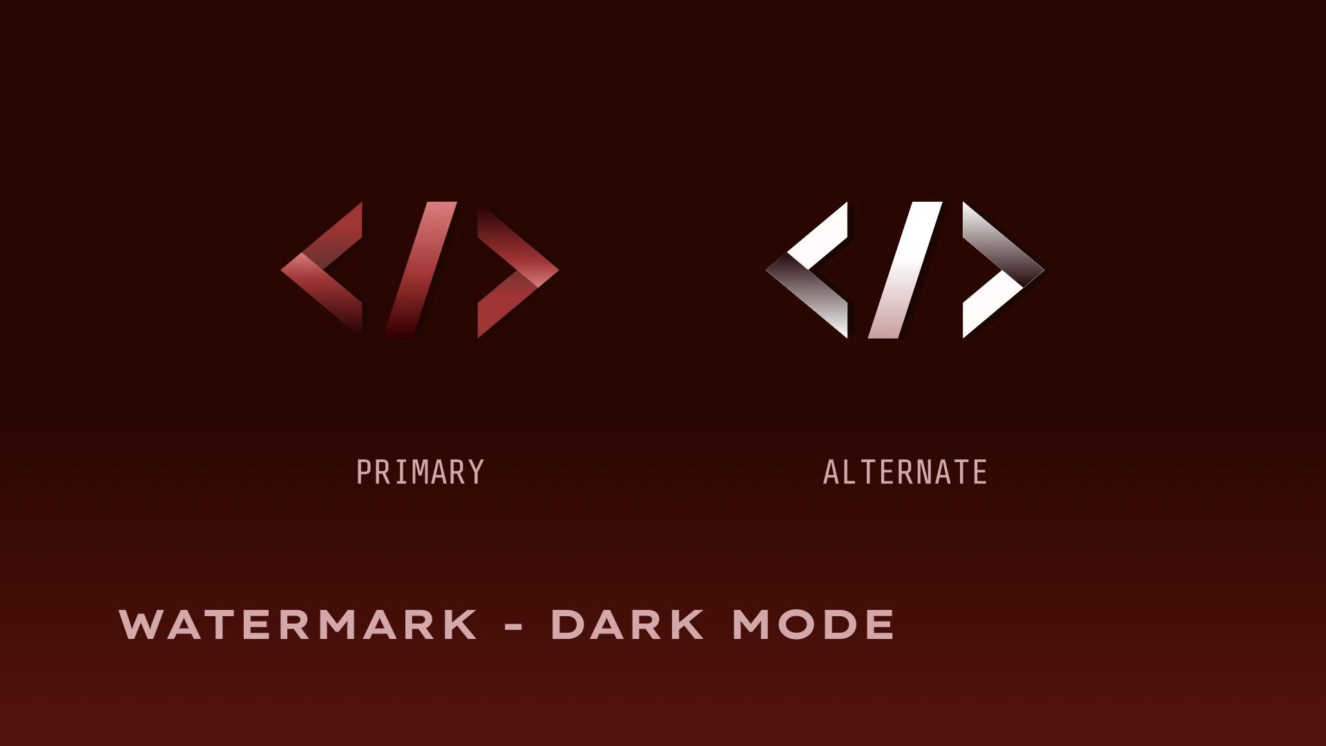
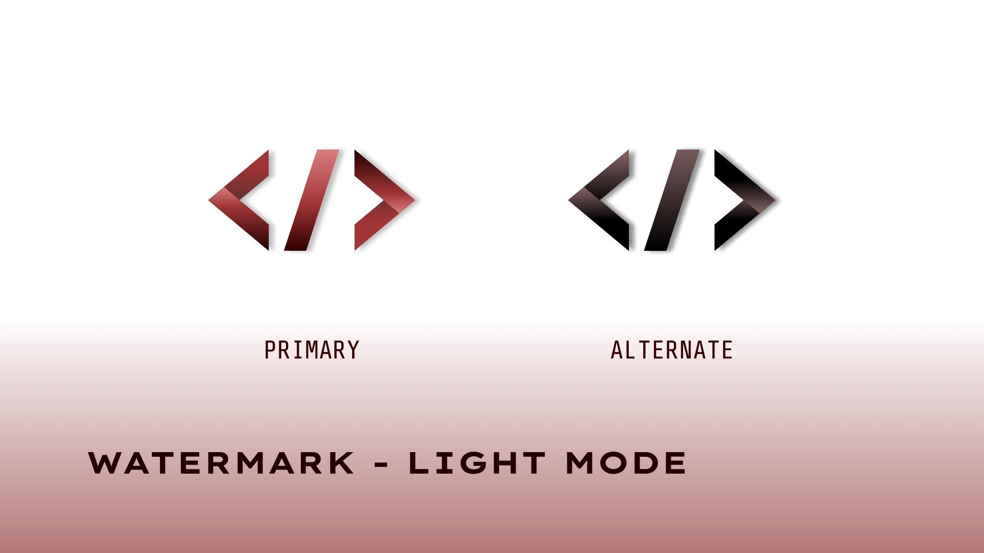
The main deliverable is a brand kit that sets out the logo, typography and colour, with every logo shown in both dark mode and light mode.
The logo pairs a code-bracket mark with the Megabyte wordmark. It comes in a primary red version and an alternate version (white on dark, black on light). The mark also works on its own as a watermark.
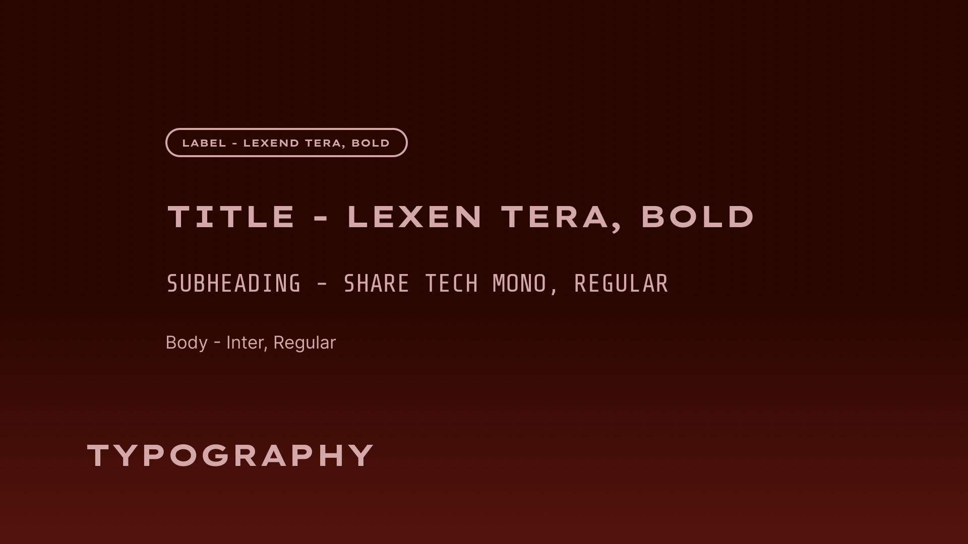
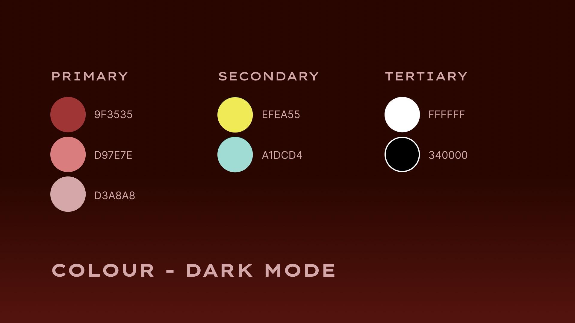
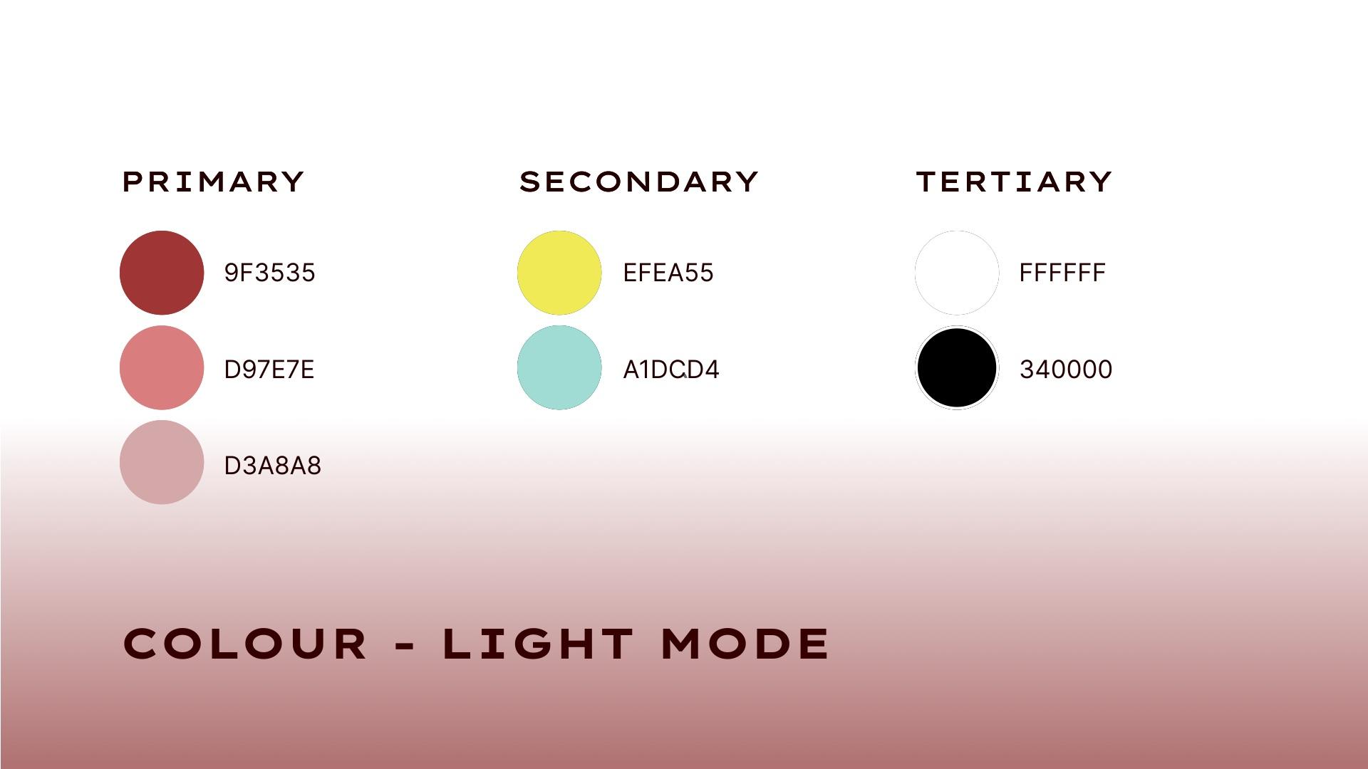
Titles and labels are set in Lexend Tera Bold, subheadings in Share Tech Mono and body text in Inter. The primary colours are three reds (#9F3535, #D97E7E, #D3A8A8), with yellow (#EFEA55) and aqua (#A1DCD4) as secondary colours and white and a deep red-black (#340000) as tertiary colours.
Alongside the kit, I sent the logo and watermark files in each version so the team can use them right away.
The club's designer now uses the kit to keep the brand consistent across their social media.
07
Results
The club's designer has been implementing the brand and following the kit closely across Megabyte's social media.
“A huge thank you to Grace for helping us bring the rebrand to life. We're so grateful for her creativity and support throughout the process.”
08
Reflection
This project was a fun modernization of an existing brand. I enjoyed working within the club's expectations, finding out what they were looking for, and helping them understand their own needs a little better.
It was one of my first projects after graduating, and it taught me a lot about working with people, setting expectations and drawing a project scope. It's natural for people to get excited about a rebrand and want to keep iterating. I learned that it's easier to set boundaries at the start than partway through, and that personal preference can't drive a project.
It also shaped how I run my freelance work. I built my studio website so I can agree on contracts and project scope before I start, and set both myself and my clients up for success.
09
Tools used
- AffinityThe first round of logo iterations.
- FigmaRefining the chosen directions, sharing a link with the club for the second round of feedback.
Freelance studio
Have a projectin mind?
Book through my studio. The short intake form asks about your project, timeline and budget, and I will get back to you about fit and next steps.